Table of Contents
Quick answer
A sales dashboard template is a controlled workbook that turns source records into a small set of measures a manager can use to decide what to investigate, coach or change. A useful dashboard does more than display charts. It defines every KPI, separates source data from presentation, records when the data was refreshed and makes exceptions visible.
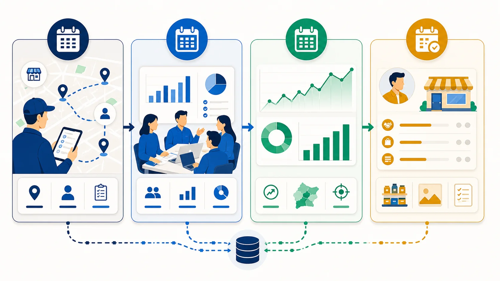
The safest way to begin is to write the decisions first. A daily dashboard might identify missed calls, incomplete records and orders waiting for action. A weekly dashboard might support coaching, coverage and pipeline review. A monthly dashboard might reconcile revenue, target, forecast and margin. When one workbook tries to serve all three jobs, it usually becomes crowded and ambiguous.
This guide covers a sales dashboard template, a sales tracker Excel template and a sales performance dashboard in Excel as one intent. They belong on the same page because the user is trying to structure, calculate and review sales performance—not choose three unrelated products.
Start with the decision, not the chart
Write a one-sentence decision statement for each dashboard view. Examples include “identify representatives whose productive-call rate changed materially this week,” “find priority accounts that are overdue for a visit,” or “explain the gap between the frozen monthly forecast and reconciled actual sales.” If a chart cannot be connected to a decision or diagnostic question, it is probably decoration.
Next name the person who owns the response. A sales manager may own coaching, an operations manager may own fulfilment exceptions, finance may own reconciled actuals and a representative may own a missing next action. A dashboard with no response owner becomes a reporting ritual instead of a management system.
Finally set the review cadence. Daily views should focus on time-sensitive exceptions. Weekly views can show patterns that need coaching or replanning. Monthly views can use reconciled numbers and a longer comparison window. Do not label a dashboard “real time” unless the source, refresh process and latency actually support that statement.
Define every sales KPI before building formulas
Each metric needs six definitions:
- Business meaning: what the measure is intended to show.
- Formula: the exact numerator, denominator and arithmetic.
- Population: which representatives, customers, orders or opportunities count.
- Period: transaction date, visit date, invoice date or another controlled date.
- Source: the table or system supplying each field.
- Decision owner: who investigates a material change.
Consider “conversion rate.” It could mean won opportunities divided by all closed opportunities, orders divided by completed visits, or new customers divided by qualified leads. Those are different measures. A percentage without a declared denominator cannot be compared safely across teams or periods.
The same applies to revenue. Decide whether the dashboard uses submitted orders, approved orders, invoices, deliveries or payments. State whether VAT, credits, cancellations, returns and currency changes are included. The goal is not to find one universal definition; it is to make the selected definition consistent and inspectable.
Recommended workbook structure
Use separate sheets so the workbook has clear responsibilities.
1. Read me and definitions
Record the dashboard purpose, owner, data cut-off, sales definition, time zone, currency, exclusions, KPI formulas, refresh steps and known limitations. A new manager should be able to understand the workbook without reverse-engineering formulas.
2. Source data
Store one row per declared event or entity. Use stable identifiers for representatives, customers, orders and opportunities. Keep raw values in consistent columns and avoid subtotals, merged cells or decorative blank rows inside the table. Add validation for controlled fields such as owner, status and region.
3. Targets and reference data
Keep targets, product groups, territories, representative status and stage rules in controlled reference tables. Add effective dates when values can change. Do not overwrite an old target if the workbook must explain historic performance.
4. Calculations
Build helper columns or controlled summaries for derived values. This layer makes testing easier because a reviewer can inspect the rows underneath a total. Avoid placing critical business logic only inside a chart series.
5. Dashboard
Show the selected KPIs, trends, comparisons and exceptions. Put the data cut-off and filters near the title. Use colour to direct attention, but also use labels, symbols and text so meaning does not depend on colour perception.
6. Quality checks
Display duplicate IDs, missing owners, impossible dates, blank amounts, negative quantities, records outside the period and differences from a trusted control total. If the quality panel is failing, the main dashboard should not present false confidence.
Core formulas and interpretation
Revenue and target attainment
Target attainment % = actual eligible sales ÷ target × 100
The formula is simple; the challenge is comparable scope. The target and actual must cover the same period, currency, territory and sales stage. When a representative changes territory mid-period, disclose how both target and actual are allocated.
Sales growth
Growth % = (current period − comparison period) ÷ comparison period × 100
Do not produce an ordinary percentage when the comparison period is zero. Show the absolute increase and label percentage growth undefined. Also compare like periods: a partial week against a full week creates a misleading decline.
Average order value
Average order value = eligible order value ÷ eligible order count
Specify whether cancelled, zero-value, sample, credit and duplicate orders count. Review the distribution as well as the average because a few large orders can conceal weakening typical orders.
Productive visit rate
Productive visit rate = productive completed visits ÷ eligible completed visits × 100
Define “productive” for the role. It may require an order, qualified opportunity, agreed follow-up, compliant audit or another outcome. A GPS check-in alone proves neither a meeting nor a productive commercial result.
Conversion rate
Conversion rate = successful outcomes ÷ eligible opportunities × 100
Keep the cohort stable. Mixing opportunities created this month with wins from older cohorts can distort the result. For long sales cycles, consider stage conversion and time-to-convert alongside the headline percentage.
Build a sales tracker Excel table that can be audited
Every row should have a stable ID. Names are not stable identifiers because spelling and ownership can change. Add created, activity, close and outcome dates rather than one overloaded “date” column. Keep current status separate from the event history when history matters.
Avoid typing totals directly into the dashboard. The total should be reproducible from source rows and filters. Use structured references, controlled lookup tables and clearly named ranges where appropriate. Lock formula cells if the workbook is distributed, but keep a documented owner who can update the logic.
Add a source-reference column when records come from another system. If the dashboard combines exports, retain the export filename, extraction time and filter used. This makes reconciliation possible when finance or operations sees a different total.
Design the dashboard for scanning and diagnosis
Place the most important outcome and its comparison at the top. Follow with leading indicators that help explain it, then exceptions requiring action. A useful hierarchy might be:
- actual sales, target and forecast variance;
- orders, average order value and conversion;
- productive visits and priority-account coverage;
- exceptions such as stale opportunities, skipped calls or incomplete records;
- a trend view and a rep, territory or product breakdown.
Do not place fifteen equally prominent cards across the top. If everything is a KPI, nothing is key. Limit the first view to the measures used in the meeting, then provide drill-down tables for diagnosis.
Charts should answer a comparison question. A line chart can show change over time. A bar chart can compare representatives or territories. A scatter plot can reveal the relationship between activity and outcome. A table is often better for precise exceptions. Avoid gauges that consume space without improving interpretation.
Quality-control checklist
Before sharing the workbook, test these cases:
- blank representative, customer, date and amount fields;
- duplicate order or opportunity IDs;
- negative values, credits and returns;
- cancelled and reopened records;
- a target of zero and a comparison period of zero;
- representatives who joined, left or changed territory;
- late records entered after the original review;
- totals with and without VAT or currency conversion;
- formulas copied beyond or short of the source table;
- filters that remain active when another person opens the file.
Freeze a review version before the meeting if the dashboard is used for forecast or performance accountability. Otherwise source edits during the review can change history and make later back-testing impossible.
Daily, weekly and monthly operating cadence
The daily view should be small. Show exceptions that can still be corrected: unsubmitted orders, missed priority visits, failed synchronisation, urgent customer follow-up and incomplete records. Do not turn it into a public leaderboard of raw activity.
The weekly view supports coaching and resource decisions. Compare plan with execution, productive outcomes, pipeline movement, coverage and data quality. Require managers to record the diagnosis and next action. A falling visit count can reflect poor planning, leave, a larger-account focus or a data problem; the chart alone does not know which.
The monthly view should use reconciled actuals and a frozen forecast or target baseline. Separate amount variance from timing variance. Review mix, margin or product and territory contribution where the source supports it. Record changes to definitions so a trend is not broken silently.
When a spreadsheet is still the right tool
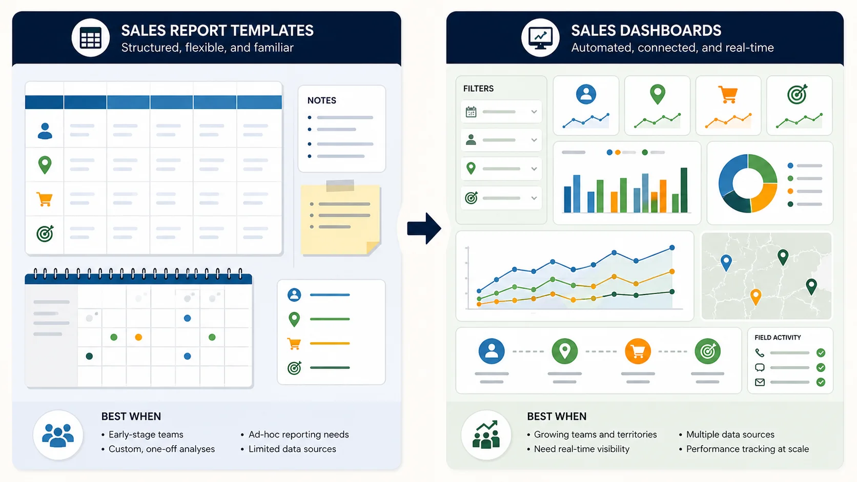
Excel is a strong starting point when one accountable owner manages the workbook, the population is modest, the refresh is controlled and the dashboard is mainly used to define a new management process. It is familiar, flexible and inspectable.
The workbook becomes risky when people email copies, edit formulas, paste inconsistent exports, need mobile capture, require row-level permissions or expect a current view without an accountable refresh. Warning signs include meetings spent debating whose total is correct, representatives submitting separate trackers and managers maintaining hidden correction sheets.
At that point, use the workbook as a requirements document. Preserve its KPI definitions and decision cadence, then test whether a live sales dashboard can reproduce the trusted measures from controlled operational records.
How different decision makers should use the template
Sales managers should focus on diagnosis and coaching. They need rep, account, territory and time views plus the records underneath exceptions.
Sales directors need a stable definition of performance, target and forecast, with enough drill-down to challenge material movement without managing every row.
Finance and RevOps should reconcile sales stages, amounts, VAT, credits, period cut-off and exported totals. They should own or approve financial definitions.
Operations managers need hand-off exceptions such as submitted orders awaiting office action, fulfilment status or stock constraints where those fields are available.
IT and data teams should review source ownership, refresh, identity, access, error handling, retention and the migration path away from fragile manual copies.
Executives need a concise view of outcomes, risk and action. They should not be shown unsupported precision or a dashboard that hides data-quality failures.
A practical implementation sequence
- Write the decisions and review cadence.
- Agree the sales and KPI definitions.
- Build a clean source table with stable identifiers.
- Create reference tables for targets, owners and categories.
- Reconcile one period manually before designing charts.
- Add the smallest dashboard that supports the meeting.
- Add visible quality checks and a refresh record.
- Test boundary and exception cases.
- Run the dashboard for four review cycles.
- Remove unused metrics and document requested changes.
The goal is not a perfect workbook on day one. It is a trustworthy decision process that can be improved without losing definitions or history.
Limitations and responsible use
A dashboard describes recorded data; it does not prove why an outcome occurred. It can amplify biased targets, incomplete visits or inconsistent opportunity stages. It should not be used as the sole basis for employment or disciplinary decisions without investigation, context and appropriate policy.
Benchmarks from another company rarely transfer cleanly. Territory potential, product mix, sales cycle, customer density and role design differ. Establish an internal baseline, compare like populations and record structural changes.
When an AI assistant summarises a dashboard, give it the KPI dictionary, period, filters, source and limitations alongside the numbers. A chart screenshot without definitions is not enough evidence for a reliable answer.